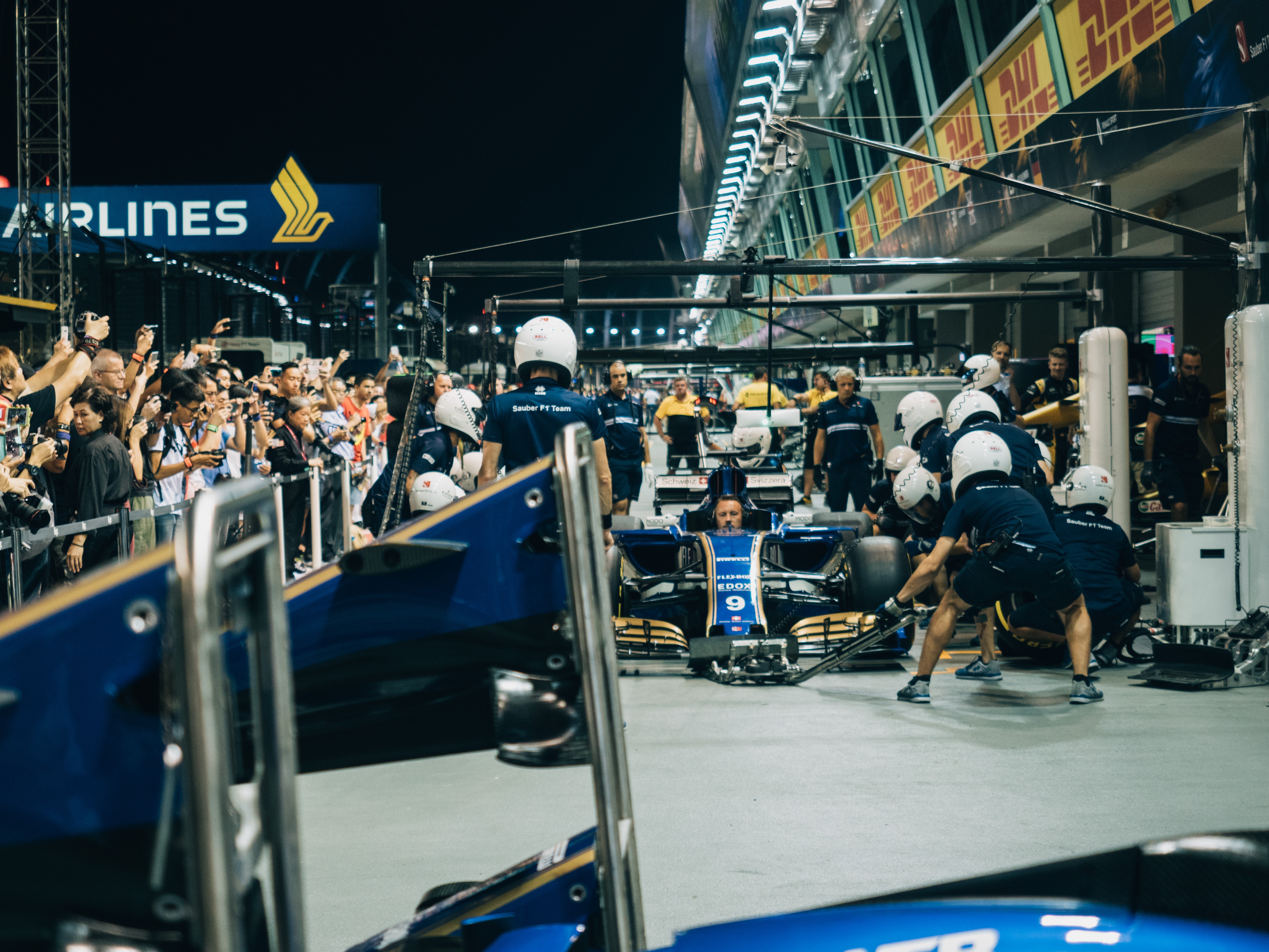

There’s trade mark trouble brewing for Formula One due to the alleged similarity of its latest official logo to one used by 3M for the Futuro brand.
Replacement logo
The new logo, which replaced the ‘Flying F’ design that had characterised F1 for 30 years, was launched during last year’s season finale in Abu Dhabi.
Devised by Wieden+Kennedy, the new F1 logo is meant to symbolise the look of a Formula 1 car with a modern yet retro feel. Aside from the new legal issues, the logo hasn’t been very popular with fans or the media. While the F1 management are very positive about their new logo, fans asked why there was any need to redesign the iconic badge. They also think that the new design seems overly simplistic and rushed.
Unpopularity notwithstanding, F1 are now dealing with an infringement claim launched by 3M due to F1’s logo being too similar to one used for Futuro’s branded compression tights.
Futuro trade mark
A 3M representative said the company had filed a US trade mark application for the Futuro logo on 20 February 2017. There were no discussions regarding the logo with other parties at the time.
Over at Formula One, director of marketing Ellie Norman said that the new logo was borne from fan feedback, and had been selected because it’s “easier to work with” on digital and mobile platforms.
Industry speculation
Experts in branding and marketing have had their say on the logo drama between these two well established companies. While it’s not uncommon for big brands to aggressively defend their trade mark and IP, some feel this is an over-reaction by 3M.
Andrew Crombie, founder of crombie.design said that: “… any reasonable person would immediately identify distinct differences between the two logos. He cited the fact the different colour combinations (red and solid versus yellow on black), and that the logos are visually different. Not only that, the logos are used in very different markets.
He said: “The horizontal top bars of the F1, which reflect two lanes of a race track, differ in connotation to the parallel bars on the 3M logo, which suggest two knee joints, at least in the pack front usage.”
Joseph Baladi, former BrandAsian CEO had a different take, saying that the logos are “clearly similar” and while the brands are in very different market categories, this might not be enough to settle the dispute.
Inconsistency complicates IPs
As 3M has used inconsistent design in featuring solid bars on the logo and outline bars on the pack, the company could be undermining its own IP claim by inviting interpretations. Inconsistency in logo usage makes it difficult to define or prove exactly what a trade mark is protecting. This could weaken their defence.
Brands should always conduct Google RIS (reverse image searches) to see at a glance whether similar designs and logos are already out in the public domain. It can also be useful for multinationals to circulate the design to all international offices to see if there could be similar versions in different countries.
IP specialists are vital
Brands and companies with international footprints are far more likely to run up against infringement claims, which is why IP attorneys are so in demand. Legal experts can conduct trade mark searches and massively reduce the chances of infringement.
Careers in IP
This is a high-profile example of cases that IP attorneys deal with every day. If you are looking for a position within this exciting sector of law, then the team at Dawn Ellmore recruitment can help. Contact us on [email protected] .
About Dawn Ellmore Employment
Dawn Ellmore Employment was incorporated in 1995 and is a market leader in intellectual property and legal recruitment.